
Last Updated on August 21, 2023
Hey and welcome to another tutorial from Codingdemos, today you will learn about one of the Android material design component called Android slider. Open Android Studio and start coding 🙂
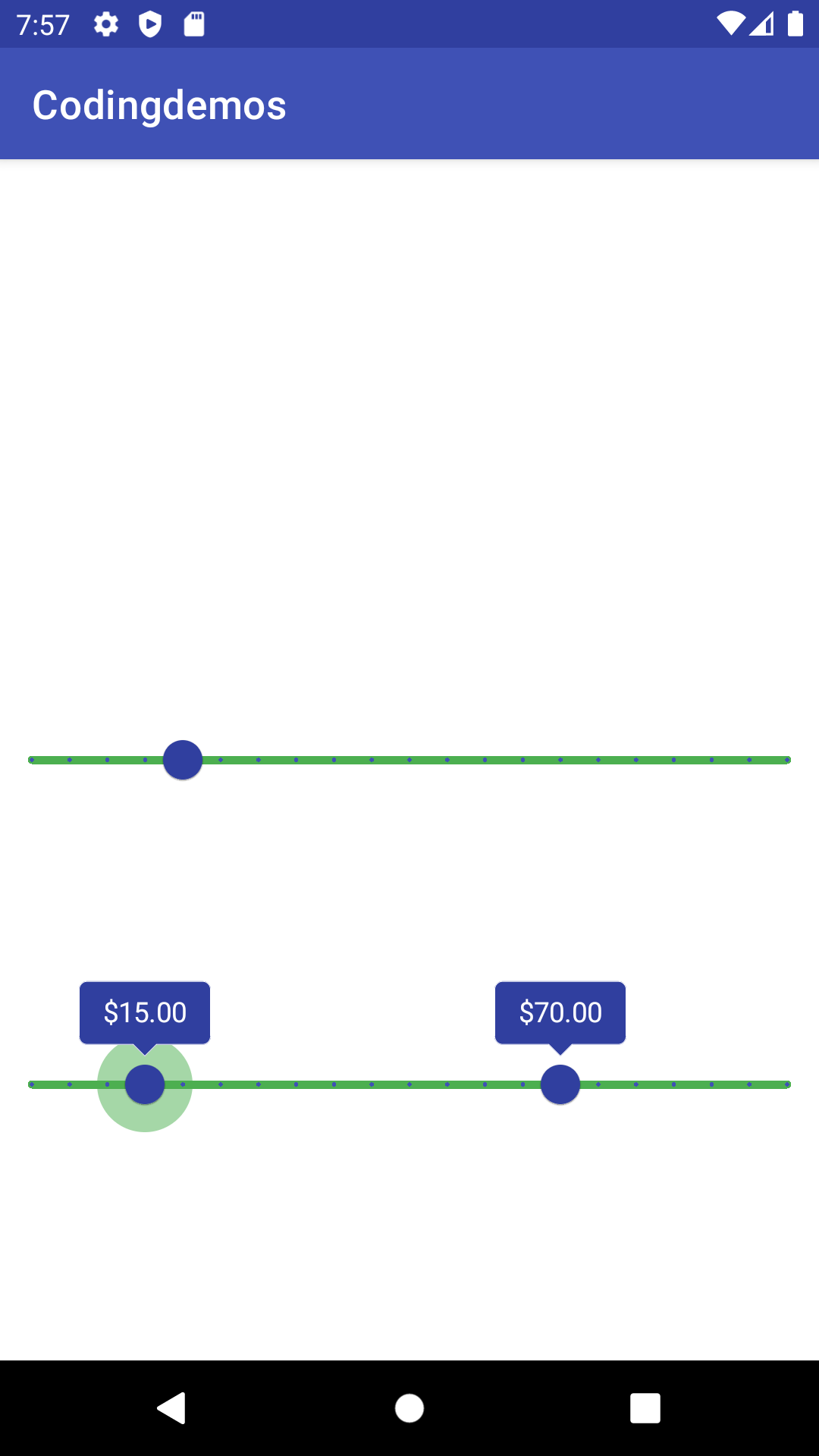
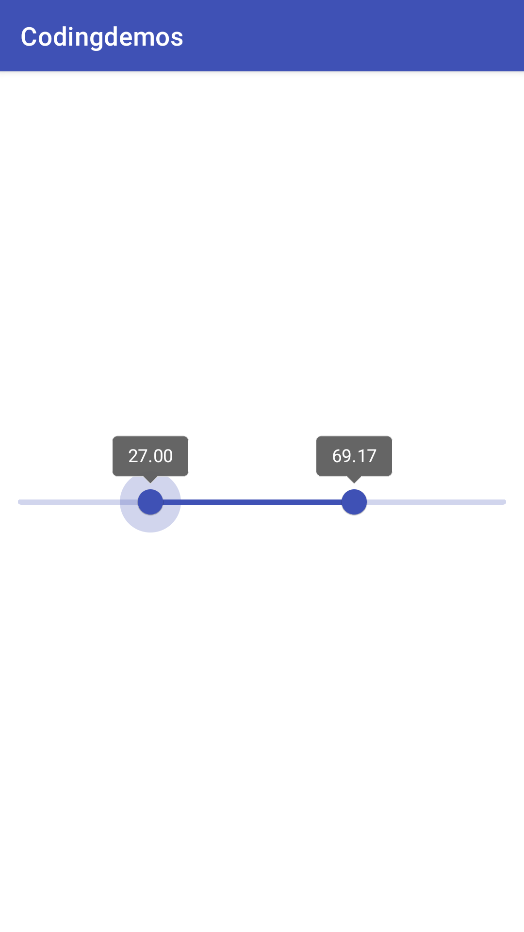
By the end of this tutorial, you will have an app that looks like this. (Large preview)
Android slider is part of the a library called Android material design components.
In this tutorial we will be using the following:
Android Studio version 4.1.2
Minimum SDK API 23
1- Open Android Studio.
Android studio 4.1.2 welcome screen. (Large preview)
2- Open build.gradle (module:app) and add the Android material design library in the dependencies.
implementation 'com.google.android.material:material:1.3.0'
3- Open build.gradle project level and add the Google’s Maven Repository .
allprojects {
    repositories {
      google()
      jcenter()
    }
  }
4- Now sync your project by clicking on Sync Now.

Android studio sync project. (Large preview)
Android Material Design Sliders
There are 2 types of Android sliders:
-
Android Continuous Slider
-
Android Discrete Slider
In this tutorial, you will learn how to work with these sliders.
Android Continuous Slider
This slider allows you to move the slider pointer to any value.
5- Next open activity_main.xml and add the material design slider.
< com.google.android.material.slider.Slider android:id="@+id/slider" android:layout_width="match_parent" android:layout_height="wrap_content"/>
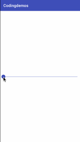
6- Build and run the app, and you will see a very simple slider.
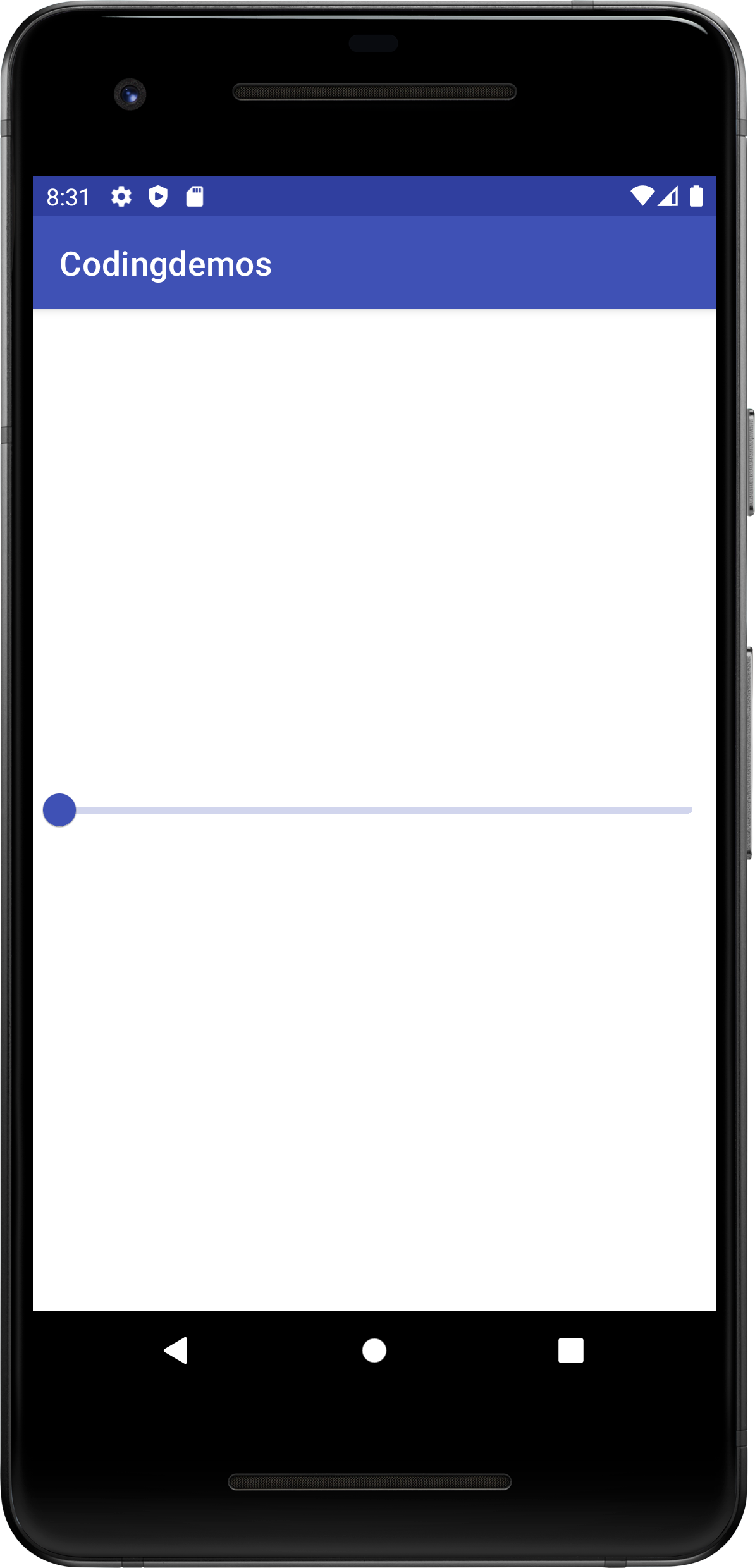
Simple looking Android material design slider. (Large preview)
Simple looking Android continous slider. (Large preview)
7- Let’s make some changes to the slider by setting a starting and ending value. Add the following code together with the one in step 5.
android:valueFrom="0"
android:valueTo="100"
8- Now build and run the app to see the result.
Android continuous slider with start and end value. (Large preview)
9- You can also position the sliding pointer to any value that you want as long as it’s within the specified android:valueFrom=”0″ and android:valueTo=”100″ range.
android:value="20"
10- Build and run the app.
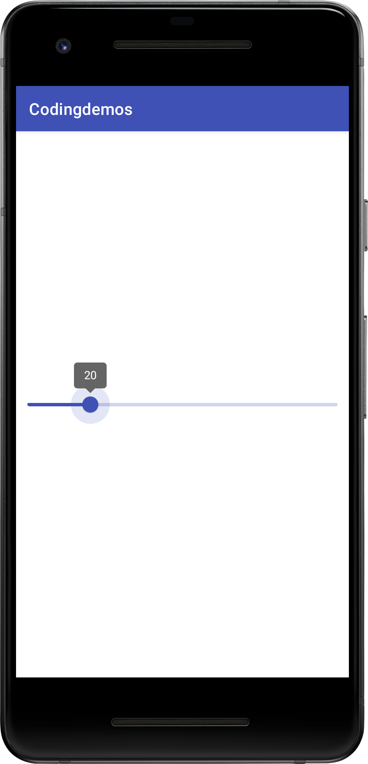
Android continuous slider with a specific value. (Large preview)
Android Discrete Slider
This slider allows you to move the sliding pointer to a specific point given by you.
11- Add the following code together with the one in step 9.
android:stepSize="5"
12- Now build and run the app to see the output.
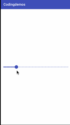
Android discrete slider. (Large preview)
Those small dots that you saw in the output above shows the step size that you have indicated in step 11.
The only difference between the Android continuous slider and the discrete slider is the discrete slider allows you to set specific values which allows you to move the sliding pointer to a certain point.
Android RangeSlider
This slider allows you to add multiple sliding pointers on the same slide. This type of slider is mostly implemented in shopping apps where you want to filter the item prices.
13- Inside activity_main.xml file, add the following code.
< com.google.android.material.slider.RangeSlider android:id="@+id/sliderRange" android:layout_width="match_parent" android:layout_height="wrap_content" />
14- Now build and run the app and you will get this simple slider.
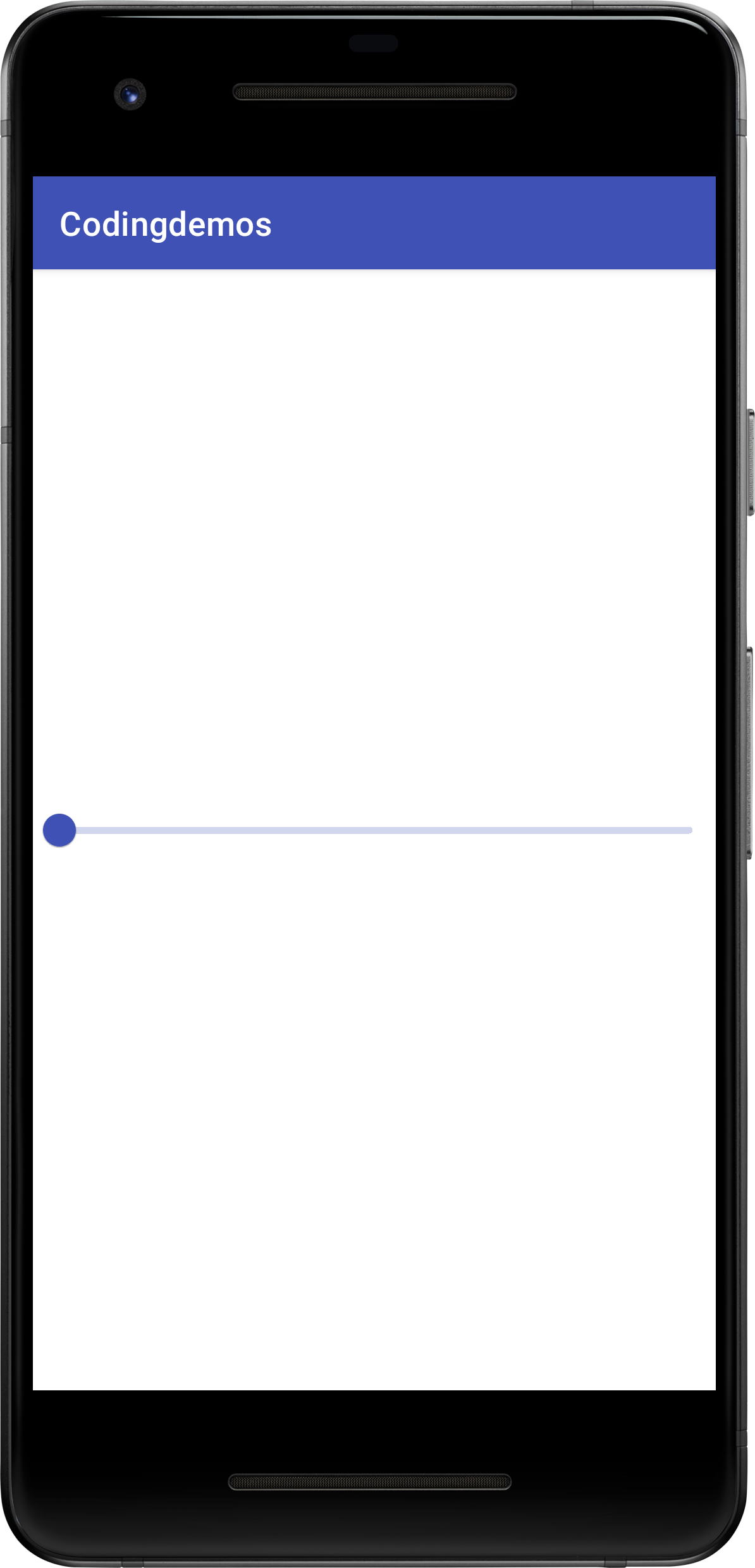
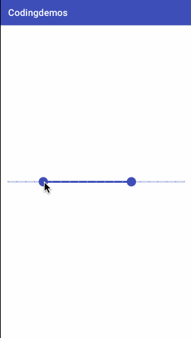
Android rangeslider. (Large preview)
15- In order to add sliding pointers on the slider, you will need to initialize them inside the Strings.xml file. Open Strings.xml file, and add the following code.
< string-array name="rangeSliderValues" >
    < item>20< /item>
    < item>70< /item>
< /string-array>
This array rangeSliderValues holds the sliding pointers that you want to show in the slider range. Now modify the code in step 13 by including this array.
app:values="@array/rangeSliderValues"
16- Build and run the app and it will crash with the following exception.
java.lang.IllegalStateException: Slider value(20.0) must be greater or equal to valueFrom(0.0), and lower or equal to valueTo(1.0)
17- The reason the app crashed is that you didn’t set the start and end value for the slider. Let’s add them now.
android:valueFrom="0"
android:valueTo="100"
18- Now build and run the app to see the output.
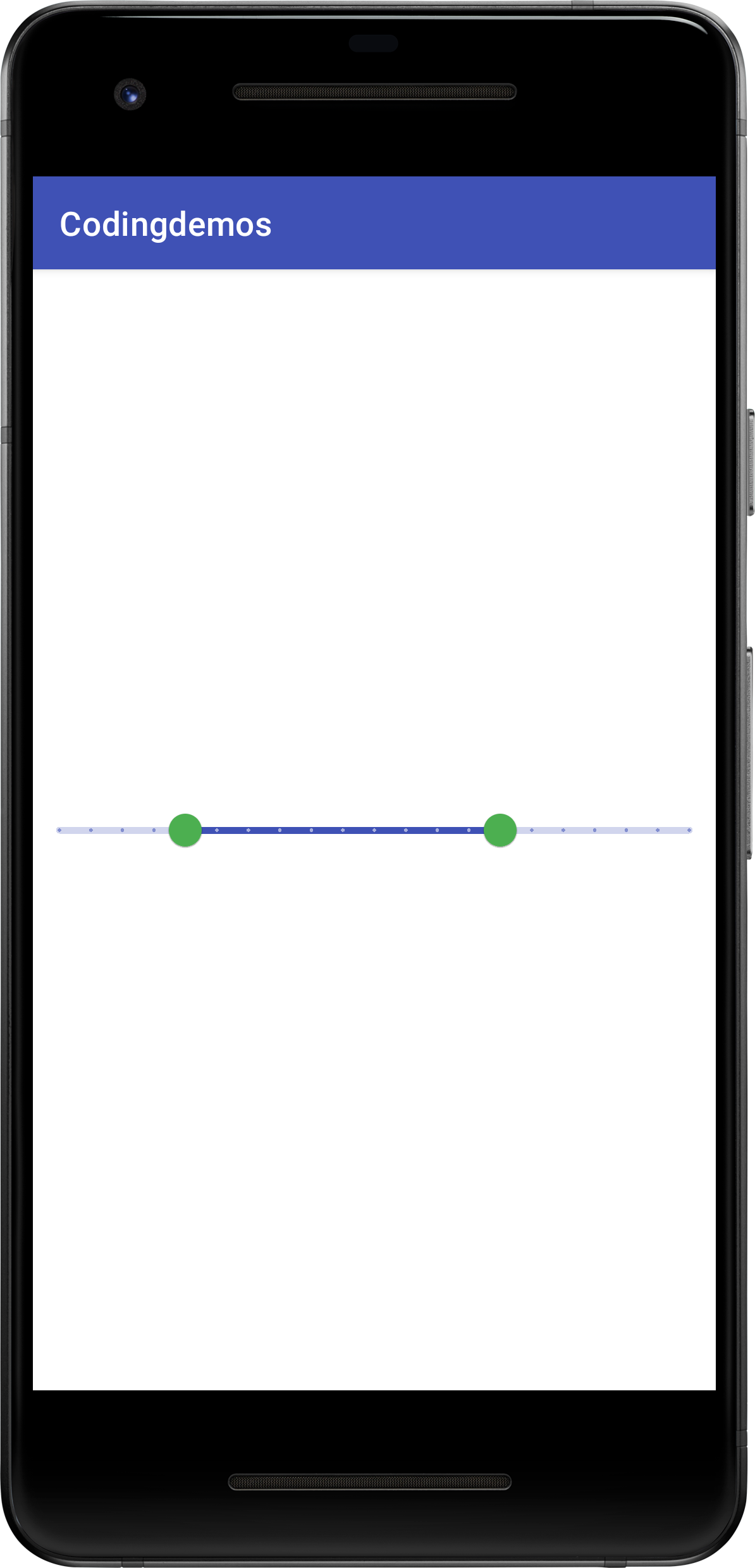
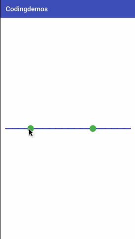
Android rangeslider with mutiple pointers. (Large preview)
19- You can also change the Android rangeslider to discrete slider using android:stepSize.
android:stepSize="5"
20- Let’s build and run the app to see the result.
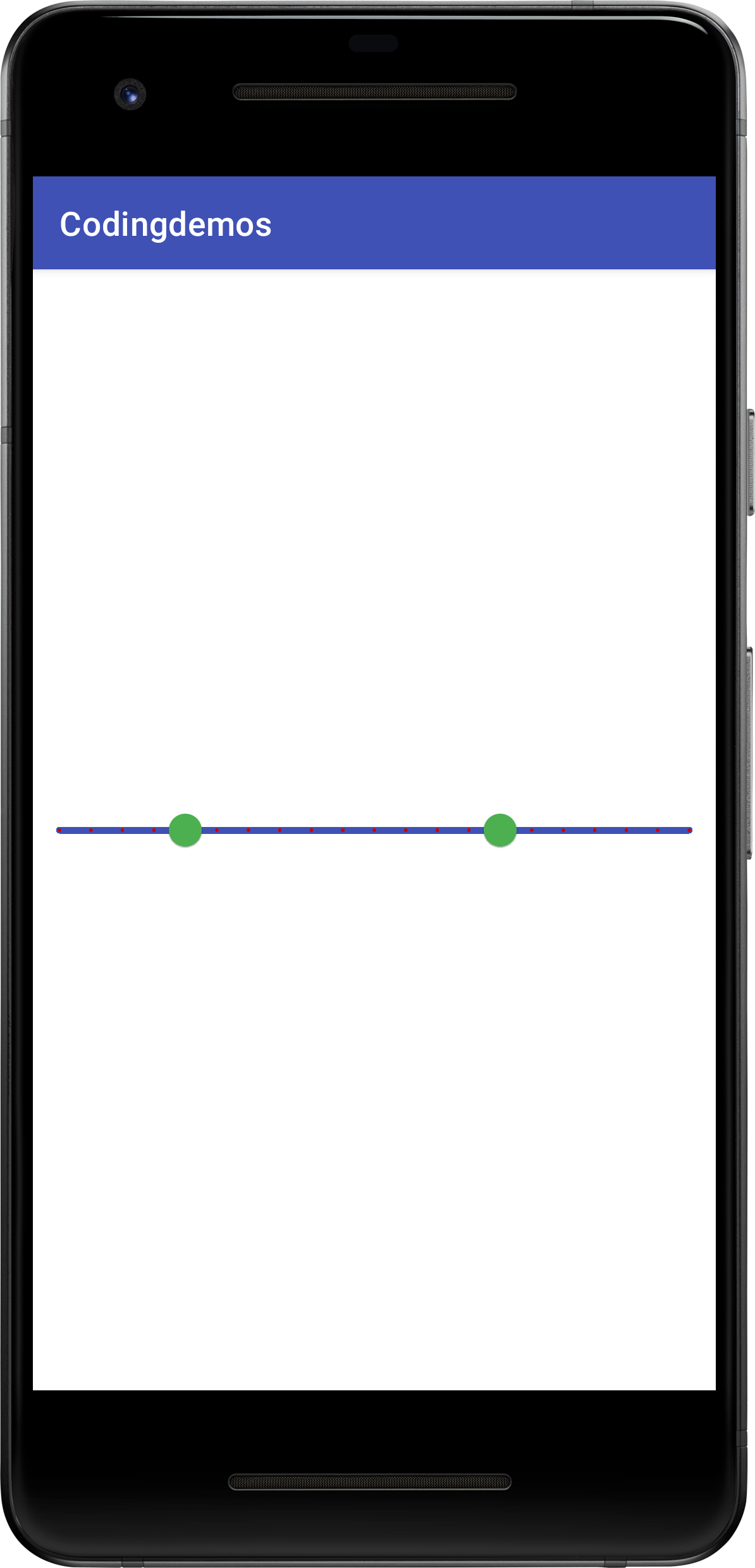
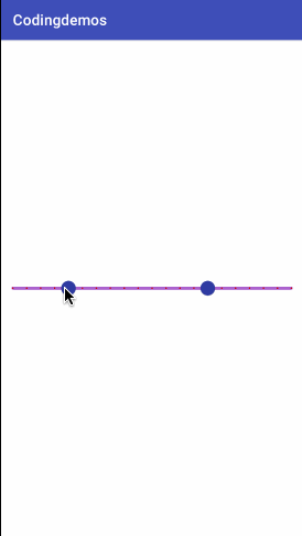
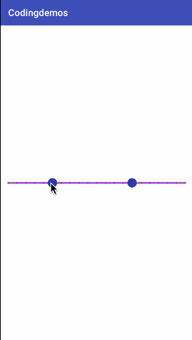
Android rangeslider with stepSize points. (Large preview)
Android slider color customization
In this section, you will learn how to customize the appearance of the sliders.
21- You can change the color of the slider pointer or as it’s called Thumb by adding the following code.
app:thumbColor="@color/colorPrimaryDark"
22- Build and run the app.
Changed the color of Android rangeslider thumb. (Large preview)
23- You can change the color of the stepSize points or as it’s called Tick mark by adding the following code.
app:tickColor="@android:color/holo_red_dark"
24- Build and run the app.

Changed the color of Android discrete slider tick mark. (Large preview)
25- You can also change the color of the Android slider track by adding the following code.
app:trackColor="@color/colorPrimary"
26- Let’s build and run the app.
Changed the color of Android slider track. (Large preview)
27- Let’s change the color of the circle that surrounds the slider thumb as you tap to change its value.
app:haloColor="@android:color/holo_orange_light"
28- Build and run the app to see the result.
Changed the circle color of Android slider thumb. (Large preview)
29- Let’s change the color of the label that shows the value of the slider as you move it left and right. Open styles.xml file, and add the following code.
< style name="Widget.App.Tooltip" parent="Widget.MaterialComponents.Tooltip">
    < item name="android:textAppearance">@style/TextAppearance.App.Tooltip< /item>
    < item name="backgroundTint">@color/colorPrimaryDark< /item>
< /style>
Here you need to create a custom style to change the appearance of the label. Now you can reference that style that you’ve just created back into the Android slider view like this.
app:labelStyle="@style/Widget.App.Tooltip"
30- Now build and run the app.
Changed the appearance of Android slider label. (Large preview)
Customize Android slider label format
In this section, you will learn how to customize the Android slider to make it show a currency sign next to the value. You usually see this type of slider in shopping apps as you move the slider left-right to filter the list of items based on the selected price.
31- Open MainActivity.java file, we want to show a Dollar sign in the slider range label. Declare the slider and initialize it by referencing it’s ID from the XML file.
RangeSlider rangeSlider = findViewById(R.id.sliderRange);
32- You will use a method called setLabelFormatter which will allow you to format the label. Let’s add the following code.
rangeSlider.setLabelFormatter(new LabelFormatter() {
      @NonNull
      @Override
      public String getFormattedValue(float value) {
        return null;
    }
});
33- Now in order to get the type of currency, you will use a method called NumberFormat.
NumberFormat currencyFormat = NumberFormat.getCurrencyInstance();
34- You can use currencyFormat variable to access the type of currency that you want. In this example, you will set the currency type as USD so that you can show the Dollar sign next to the slider label.
currencyFormat.setCurrency(Currency.getInstance("USD"));
35- Finally, you will need to return the value back to getFormattedValue function for this to work.
return currencyFormat.format(value);
36- Now let’s build and run the app to see the result.
Custom slider label with a Dollar sign. (Large preview)
37- Here is the full code for activity_main.xml file.
< ?xml version="1.0" encoding="utf-8"? >
< androidx.constraintlayout.widget.ConstraintLayout xmlns:android="http://schemas.android.com/apk/res/android" xmlns:app="http://schemas.android.com/apk/res-auto" xmlns:tools="http://schemas.android.com/tools" android:layout_width="match_parent" android:layout_height="match_parent" tools:context=".MainActivity" >

  < com.google.android.material.slider.Slider android:id="@+id/slider" android:layout_width="match_parent" android:layout_height="wrap_content" android:stepSize="5" android:value="20" android:valueFrom="0" android:valueTo="100" app:haloColor="@color/colorAccent" app:layout_constraintBottom_toBottomOf="parent" app:layout_constraintEnd_toEndOf="parent" app:layout_constraintStart_toStartOf="parent" app:layout_constraintTop_toTopOf="parent" app:thumbColor="@color/colorPrimaryDark" app:tickColor="@color/colorPrimary" app:trackColor="@color/colorAccent" />

  < com.google.android.material.slider.RangeSlider android:id="@+id/sliderRange" android:layout_width="match_parent" android:layout_height="wrap_content" android:stepSize="5" android:value="20" android:valueFrom="0" android:valueTo="100" app:haloColor="@android:color/holo_orange_light" app:labelStyle="@style/Widget.App.Tooltip" app:layout_constraintBottom_toBottomOf="parent" app:layout_constraintEnd_toEndOf="parent" app:layout_constraintStart_toStartOf="parent" app:layout_constraintTop_toBottomOf="@id/slider" app:thumbColor="@color/colorPrimaryDark" app:tickColor="@android:color/holo_red_dark" app:trackColor="@android:color/holo_purple" app:values="@array/rangeSliderValues" />

< /androidx.constraintlayout.widget.ConstraintLayout >
38- Here is the full code for MainActivity.java file.
package com.codingdemos.codingdemos;

import android.os.Bundle;

import com.google.android.material.slider.LabelFormatter;
import com.google.android.material.slider.RangeSlider;

import java.text.NumberFormat;
import java.util.Currency;

import androidx.annotation.NonNull;
import androidx.appcompat.app.AppCompatActivity;

public class MainActivity extends AppCompatActivity {

  RangeSlider rangeSlider;

  @Override
  protected void onCreate(Bundle savedInstanceState) {
    super.onCreate(savedInstanceState);
    setContentView(R.layout.activity_main);

    rangeSlider = findViewById(R.id.sliderRange);
    rangeSlider.setLabelFormatter(new LabelFormatter() {
      @NonNull
      @Override
      public String getFormattedValue(float value) {
        NumberFormat currencyFormat = NumberFormat.getCurrencyInstance();
        currencyFormat.setCurrency(Currency.getInstance("USD"));
        return currencyFormat.format(value);
      }
    });

  }
}
39- I hope you find this tutorial helpful and if you have any questions please post them in the comment below.
Fantastic tutorial. Very clear explained.
Can I expand the textsize of the slidervalues ?
Hi Ruud, I’m glad that you liked the tutorial 🙂
I’m not sure if it’s possible, because it wasn’t mentioned in the Slider documentation.